
How to handle multiple modals in React


Most applications have plenty of modals also sometimes referred to as popover, dialogs or popups. The most obvious way of displaying a modal in our application is to add a state in our component which indicates whether the modal is open or closed, and a button that can open up the modal
But having to add a local state for every modal and conditional rendering can become pretty repetitive! Example:
const [isLoginModalOpen, toggleLoginModal] = useState(false)
const [isRegisterModalOpen, toggleRegisterModal] = useState(false)

return (
  <>
    <button onClick={() => toggleLoginModal(true)}>Login</button>
    {isLoginModalOpen ? <LoginModal /> : null}
    <button onClick={() => toggleRegisterModal(true)}>Register</button>
    {isRegisterModalOpen ? <RegisterModal /> : null}
  </>
)
There are ways to avoid these repetitions. To name a few, you could use context, event emitters or state app management libraries like Redux. This article is going to show you how you can achieve this using context, which is built into React so no need to import other libraries. And we’re also going to extend that solution to make the modals handle server request that makes them more solid and bugfree.
Global modals
Here’s Kent C Dodd’s amazing tweet that I bumped into last year. It completely changed the way I do modals.
I do this with the modal component: https://t.co/Tvu1qvY0nl
— Kent C. Dodds (@kentcdodds) June 30, 2020
And then I made this: https://t.co/cV7YQVS93f
Which is used like this: https://t.co/wfpg84L4ew
:)
Using this method the example above could look so much simpler or like this:
import {Modal, ModalOpenButton} from './Modal';
....
return (
  <>
    <Modal>
      <ModalOpenButton>
        <button>Login</button>
      </ModalOpenButton>
      <LoginModal />
    <Modal>
    <Modal>
        <ModalOpenButton>
          <button>Register</button>
        </ModalOpenButton>
        <RegisterModal />
    </Modal>
)
The states are no longer in our component that could be handeling lots of other stuff. Instead the modal logic is entirely encapsulated inside the the Modal component - which makes much more sense!
This is possible thanks to context, don’t panic when you hear the word context. Context can mess up React apps and reduce performance if it’s not used correctly. But here it’s being used in isolation.
Kent C. Dodds is using Reach UI in his example which is a really cool UI library that is very composable. In my example I’ll be using a modal from Material-UI just to simplify the article. Usually I’m using a modal from my own UI library and you can replace this modal by any modal you like
Let’s take a look at this code (that originally was from Kent C. Dodds but has been only slightly modified by me). Below are some explanations.
import * as React from "react"
import styled from "styled-components"
import Dialog from "@material-ui/core/Dialog"

import DialogTitle from "@material-ui/core/DialogTitle"

const callAll = (...fns) => (...args) => fns.forEach(fn => fn && fn(...args))

const ModalContext = React.createContext()

function Modal(props) {
  const [isOpen, setIsOpen] = React.useState(false)
  return <ModalContext.Provider value={[isOpen, setIsOpen]} {...props} />
}

function ModalDismissButton({ children: child }) {
  const [, setIsOpen] = React.useContext(ModalContext)
  return React.cloneElement(child, {
    onClick: callAll(() => setIsOpen(false), child.props.onClick),
  })
}

function ModalOpenButton({ children: child }) {
  const [, setIsOpen] = React.useContext(ModalContext)
  return React.cloneElement(child, {
    onClick: callAll(() => setIsOpen(true), child.props.onClick),
  })
}
function ModalContentsBase(props) {
  const [isOpen, setIsOpen] = React.useContext(ModalContext)
  return (
    <Dialog open={isOpen} onClose={() => setIsOpen(false)} {...props}>
      {props.children}
    </Dialog>
  )
}

function ModalContents({ title, children, ...props }) {
  return (
    <ModalContentsBase {...props}>
      <div style={{ padding: "20px" }}>
        <div css={{ display: "flex", justifyContent: "flex-end" }}>
          <ModalDismissButton>
            <CloseIcon className="fas fa-times"></CloseIcon>
          </ModalDismissButton>
        </div>
        <DialogTitle>{title}</DialogTitle>
        {children}
      </div>
    </ModalContentsBase>
  )
}

export { Modal, ModalDismissButton, ModalOpenButton, ModalContents }

const CloseIcon = styled.i`
  position: absolute;
  top: 10px;
  right: 10px;
  cursor: pointer;
`
<ModalContents> is just the modal itself with a title and a close icon. There you could be using any other UI library you prefer.
<ModalContentsBase> is just there if you prefer to customize the modal and you don’t want the defaults in ModalContents. But usually every modal has both a title and an close icon (x).
The brilliance in all of this is in the context. <ModalOpenButton> and <ModalDismissButton> change the state of the context to either close or open the modal. So the state can be internally inside of the modal instead of inside your component. Lets see how this is put to use:
import {Modal, ModalOpenButton, ModalContents} from './modal';
import LoginForm from './LoginForm';

const App = () ⇒ {
	<Modal>
	  <ModalOpenButton>
          <button>open modal</button>
      </ModalOpenButton>
	  <ModalContents>
		  <LoginForm />
	  </ModalContents>
	</Modal>
}
So here we have a login form that opens up in a modal when you click the “Login” button. Pretty neat huh?
Here’s a sandbox example if you want to try it out
Add asynchronous functionality
So often in modals, you have button actions like “create” something, “modify”, or “accept” something. Like here:
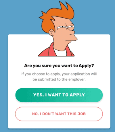
and let’s say that when you click on “yes, i want to apply”, it will send a request to the server. If the request fails, you have to make sure that the modal doesn’t close so that it will be clear to the user failed to apply! This is something that’s easily forgotten and is a very common bug in interfaces
For these asynchronous actions, we’ll create another button that can dismiss the modal upon success of the request:
export function ModalDismissAsyncButton({ children: child }) {
  const [, setIsOpen] = React.useContext(ModalContext)
  return React.cloneElement(child, {
    onClick: callAll(() =>
      child.props
        .onClick()
        .then(res => (res === "success" ? setIsOpen(false) : null))
    ),
  })
}
how it’s put to use:
//Login.js
import { ModalDismissAsyncButton } from "./modal.js"

const makeFakeRequest = () => {
  return new Promise((resolve, reject) => {
    setTimeout(() => {
      const random = Math.random() * 10
      random <= 5 ? resolve("success") : reject("error")
    }, 1000)
  })
}

function LoginForm() {
  const [error, setError] = useState()

  function onSubmit() {
    return makeFakeRequest().then(
      response => response,
      error => {
        setError(error)
      }
    )
  }

  return (
    <>
      <label>username</label>
      <input type="text" />
      <label>password</label>
      <input type="password" />
      <ModalDismissAsyncButton>
        <button onClick={onSubmit}>submit</button>
      </ModalDismissAsyncButton>
    </>
  )
}

//App.js

//just like before
function App() {
  return (
    <Modal>
      <ModalOpenButton>
        <button>Login</button>
      </ModalOpenButton>{" "}
      <ModalContents>
        <LoginForm />
      </ModalContents>
    </Modal>
  )
}
Here’s another sandbox example for async popovers. Try submitting several times until you get an error (it’s random so if you’re unlucky you have to try pretty often) - the popover will not close if you get an error and will instead dislay the error message.
Want to handle the state locally?
Even though global modals can be practical, there could be times where you want to handle the state of a modal locally. To be coherent throughout the code you can still use the same
{showModal: <Modal/>: null}That way you can also take advantage of the <ModalDissmissAsyncButton> if you need to make a server request. You might want to handle the state locally in a case where the popover fires up because of some other user’s action than a button click. Maybe you want the modal to pop up when you select some option or when you write something. In that case, you can continue to use the same system. Inside the
function Modal(props) {
  const [isOpen, setIsOpen] = React.useState(props.isOpen || false)

  useEffect(() => {
    setIsOpen(props.isOpen)
  }, [props.isOpen])

  return <ModalContext.Provider value={[isOpen, setIsOpen]} {...props} />
}
How to use:
function App() {
  const [value, setValue] = useState(false)

  return (
    <>
      <Modal isOpen={value}>
        <ModalContents>hey</ModalContents>
      </Modal>
    </>
  )
}
Here’s a little sandbox example for this case. Choose “edit” from the dropdown and the popover won’t show up. Choose “delete” from the dropdown and the popover will show up, asking you if you’re sure you want to delete. You click on “Yes I’m sure” and you have the same asynchronous behavior as before - the popover won’t close if there’s an error.
Summary
It’s so likely that your little application will end up bigger than planned and that it will handle several modals. If you think there’s a chance of this I recommend you to start implementing some system to handle multple modals. You can start with the basic modal and then add async state and the local option if needed.
Hope this helped ! Let me know on Twitter if you have some questions or comments.