
Layout Margins in Styled-Components


Often when you’re assembling reusable component together in a layout you need to add margins between them. You have no way to add a margin to your reusable components as that would break its encapsulation. So, every time you set that margin, you create a styled components margin wrapper and it feels so unnecessary and repetitive to create a new styled components wrapper, only for that purpose!
Example
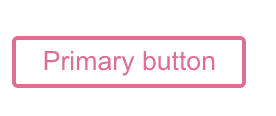
As an example we’ll use this reusable button that I’ve taken from styled-components’ website
import React from "react"
import styled from "styled-components"
const StyledButton = styled.button`
background: transparent;
border-radius: 3px;
border: 2px solid palevioletred;
color: palevioletred;
padding: 0.25em 1em;
`
function Button({ primary, ...props }) {
return <StyledButton primary={primary} {...props} />
}
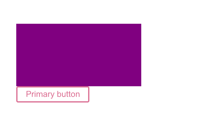
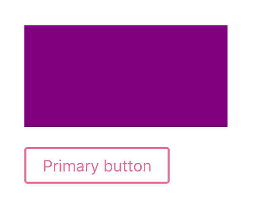
export default ButtonWe want the reusable button to appear below a reusable violet card component. So we assemble those two components in a layout:
function App() {
  return (
    <Container>
      <Card />
      <Button>Primary button</Button>
    </Container>
  )
}
But we don’t want it to be pressed up against the card above it so we’d like to add 20px space between the button and the card. We could put it on the card or the button. Let’s just put a margin on the button. What lots of people do is this:
//App.js

const ButtonWrapper = styled.span`
    margin-top: 20px;
`

//Or like this

//  const ButtonWrapper = styled(Button)`
//    margin-top: 20px;
//  `;
...
<ButtonWrapper>
  <Button>Primary button</Button>
</ButtonWrapper>
...
But we’re tired of creating a new wrapper eeeverytime we use this button!
Maybe this isn’t how you set your margins, but you could take a look at the list below and get some new ideas. There are lots of different possibilities and I’ll list few of them in this article, also mentioning some of their cons which could help you pick your favorite solution. Not all those solutions are my favorite ones, but I’ll include them anyways as they’re completely valid and nothing wrong with them.
Different ways of adding a margin in SC
- Are you sure you really need margins ?
- Set margin with styled-components
- Pass inline styles as props
- Pass margins as props
- Target the component from the view wrapper
- Reusable Margin wrapper in SC
- Use tools like styled-system, theme-ui, tailwind etc
- Use spacers instead of margins
Are you sure you really need margins?
The best is of course if you could achieve that space with CSS in your layout wrapper. You could try and see if css grid could do the spacing for you in the Container component. This can be handy in some cases, in others not. You could also use the new gap feature of flexbox but be careful, as I’m writing this it doesn’t yet have full browser support
const Container = styled.div`
  display: grid;
  grid-gap: 20px;
`
Set margin with styled-components
Pass inline styles as props
You could also add a default value to your styled component that will get overwritten by inline styles.
//App.js

;<Button style={{ marginTop: "20px" }}>Primary button</Button>

//Button.js
const Button = styled.div`
  margintop: 5px ..... etc.;
`
cons:
- not very reusable
- if you’d like it later to be reusable it’s frustrating to transform inline styles to styled-components because you have to change the syntax from camelCase into normal css.
Reusable Margin wrapper in SC
You could make a reusable Margin wrapper in SC to avoid recreating a component every time.
// theme/sharedStyleComponents.js

const Margin = styled.span`
  margin: ${({ margin }) => margin};
  margin-top: ${({ mt }) => `${mt}px`};
  margin-right: ${({ mr }) => `${mr}px`};
  margin-bottom: ${({ mb }) => `${mb}px`};
  margin-left: ${({ ml }) => `${ml}px`};
`

//App.js
import { Margin } from "theme/sharedStyledComponents"
;<Margin mt={20}>
  <Button>Primary button</Button>
</Margin>
cons:
- If you’d want to add things than just margins, like index, padding, position, z-index, top, etc…, then you’d have to add another wrapper for that.
Pass margins as props
You can also add default value in the component
//App.js

<Button mt="20">Primary button</Button>

//Button.js
const StyledButton = styled.button`
	margin-top: ${({ mt }) => `${mt}px`};
	etc....
`;

//or shortwrite, if you want to
//be able to set left, right
//and bottom margins all at once:


//App.js

<Button margin="20px 0px 0px 0px">Primary button</Button>

const StyledButton = styled.button`
  margin: ${({ margin }) => margin};
Here’s a neater syntax for this
//utils/spacer.js or elsewhere

const spacer = (props) => ({
  margin: props.margin,
  mt: props.mt,
  mr: props.mr,
  mb: props.mb,
  ml: props.ml,
  padding: props.padding,
  pt: props.pt,
  pr: props.pr,
  pb: props.pb,
  pl: props.pl,
});


//Button.js
import {spacer} from 'utils/spacer';

const StyledButton = styled.button`
 ${spacer};
`

//App.js
<Button mt="20px">Primary button</Button>
You can also do some tricks in order not having to define the px after each margin if you like.
Target the component from the view wrapper
const Container = styled.div`
  button {
    margin-top: 20px;
  }
`
cons:
This will cause all buttons that are children of Container to have the same styles. The styles will leak to all the button elements. You could add a className or do some more specific targeting to reduce the probability of clashing. What’s among the best thing about styled-components is that it does not have those cascading effects so in my opinion those wrappers is not my favorite. Sometimes I use a wrapper when I’m importing a third party component and I want to target some of its classNames.
Use tools like styled-system, theme-ui, tailwind etc
You could use a library that can easily be used with styled-components. There are plenty of them out there but I’ll list 3 popular ones. Today I personally prefer using twin (tailwind+styled-components). Each of those libraries have their pros and cons, I’ll not go into all the pros and cons but you could just pick one and test it out in a project. The advantage of these libraries is that they not only make it easier for you to add margin but could also help you add other attributes in your layout.
styled-system
This one was once my favorite. Let’s see what it could look like:
//App.js

import { space } from "styled-system"
import styled from "styled-components"

const Spacer = styled.div(space)

function App() {
  return (
    <>
      <Container>
        <Card />
        <Spacer mt={20} />
        <Button>Primary button</Button>
      </Container>
    </>
  )
}
and if you need to add more things than just the margin you can read styled-system’s doc on how to create a box
theme-ui
theme-ui is built with styled-system. It’s somehow similar to styled-system:
import Button from "./Button";
import { Box } from "theme-ui";
import { ThemeProvider } from "theme-ui";
import theme from "./theme";

function App() {
  return (
    <ThemeProvider theme={theme}>
      <Container>
        <Card />
        <Box mt={5}>
          <Button>Primary button</Button>
        </Box>
      </Container>
    </ThemeProvider>
  );
}

//theme.js

const theme = {
  space: [0, 4, 8, 16, 20, 32, 64, 128, 256, 512],
  fontSizes: [12, 14, ....
  ... etc.
tailwind or twin
here’s one way of creating space between the component card and the button. This solution doesn’t even require another div.
Tailwind takes some time to get used to. I did not like it at all in the beginning but once you get into the groove, the syntax comes automatically and then it will feel like flying.
//
function App() {
  return (
    <Container>
      <Card />
      <Button>Primary button</Button>
    </Container>
  )
}

export default App

const Container = styled.div.attrs({
  className: "space-y-5",
})`
  margin-top: 100px;
  margin-left: 100px;
`
Spacing values in tailwind are using rems that are proportional to 16px which is the reason we did space-y-5 but not space-y-20.
If you want to use tailwind then I would recommend you to use it with twin. “Twin blends the magic of Tailwind with the flexibility of css-in-js”
same example, but with twin:
function App() {
  return (
    <Container>
      <Card />
      <Button>Primary button</Button>
    </Container>
  )
}

export default App

const Container = tw.div`
  mt-24
  ml-24
  space-y-5
`
On the surface this doesn’t seem different from tailwind but it actually has lots of other benefits. If you want to be convinced, here’s great article about twin.macro from Max Stoiber, the creator of styled-components
Use spacers instead of margins
It’s getting more and more common and accepted to use spacers instead of margins. That’s because margins can be pretty inpredictable.
Not everyone are at ease with spacers, especially if you’re reading old threads. A common argument is that that a div soupe isn’t semantically correct and that it influences accessibility. I have to be honest, I don’t use spacers but I’ll try it out one day. So I can’t guarantee myself that all acessibility tools work nicely in a div spacer soup but I know that with lighthouse you can pass the acessibility 100% even if you’re using spacers everywhere.
So how to replace margins by spacers? Here’s a spacer that I found in Josh Comeau’s article that also explains the pros and cons of spacers:
//utils/Spacer.js

function getHeight({ axis, size }) {
  return axis === "horizontal" ? 1 : size
}
function getWidth({ axis, size }) {
  return axis === "vertical" ? 1 : size
}
const Spacer = styled.span`
  display: block;
  width: ${getWidth}px;
  min-width: ${getWidth}px;
  height: ${getHeight}px;
  min-height: ${getHeight}px;
`

export default Spacer
Let’s see how that would look like in our example:
import Spacer from "utils/Spacer"

function App() {
  return (
    <Container>
      <Card />
      <Spacer height={20} />
      <Button>Primary button</Button>
    </Container>
  )
}

export default App
Summary
So there are lots of options! Each one has its pros and cons, none of them are bad. The world of JS quickly evolves, but especially the world of CSS-in-JS. I’m one of those who loves to try out the newest thing if I find it promising, so how I set my margins on reusable components changed a lot for the last several years. What I used to do was to use styled-components’ spacer helper that I showed you above, then I moved to styled-system, then theme-ui and today I’m using twin.macro (styled-components + tailwind). Those libraries not only make it easier to add spaces between components, they also add lots of other valuable things to styled-components. But everyone has their preferences. Just pick one that speaks to you, test it out and see if you like it :)